Led discovery research, stakeholder interviews, and usability testing to uncover key insights. Synthesized user feedback to guide and refine design decisions.
Developed wireframes and mid-fidelity prototypes to translate findings into tangible models. Created high-fidelity UI prototypes aligned with KHP’s brand guidelines to see structure of the website.
Aligned designs with business goals and technical constraints. Delivered practical solutions requiring minimal development effort, integrating seamlessly into the existing platform.
Created and delivered a client pitch with the project’s research findings, design rationale, and solutions.
Balanced immediate improvements with long-term scalability while addressing client feedback.
Youth tend to trust advice from peers, credible organizations, or professionals, and they’re cautious about social media information unless it feels safe and reliable.
Youth value seeing others like themselves in KHP’s resources and feel connected when their experiences are shared.
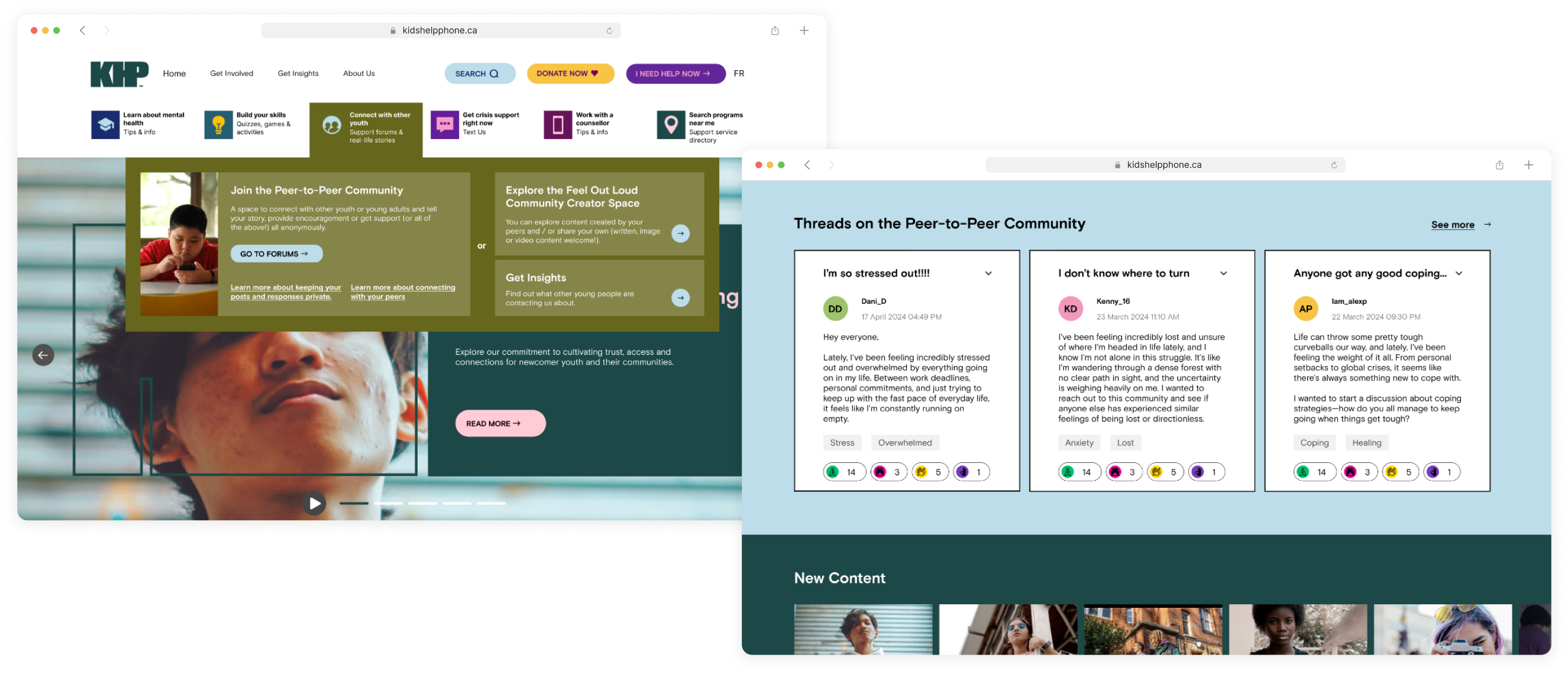
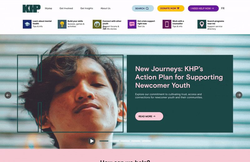
Youth prefer websites or platforms that are easy to navigate, look welcoming, and work well on both phones and laptops.
Hearing about resources from other youth, especially in anonymous forums or peer groups, feels relatable and builds confidence to reach out.
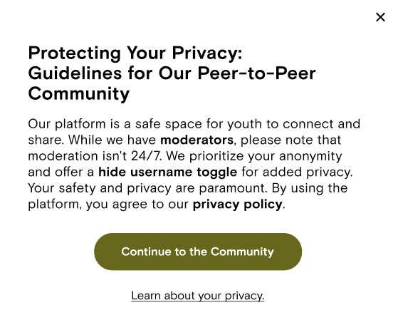
Anonymity fosters honest dialogue, reducing stigma around mental health.
The platform needs to speak directly to youth in their language, through relatable visuals and tools. They must feel safe, understood, and valued during use.
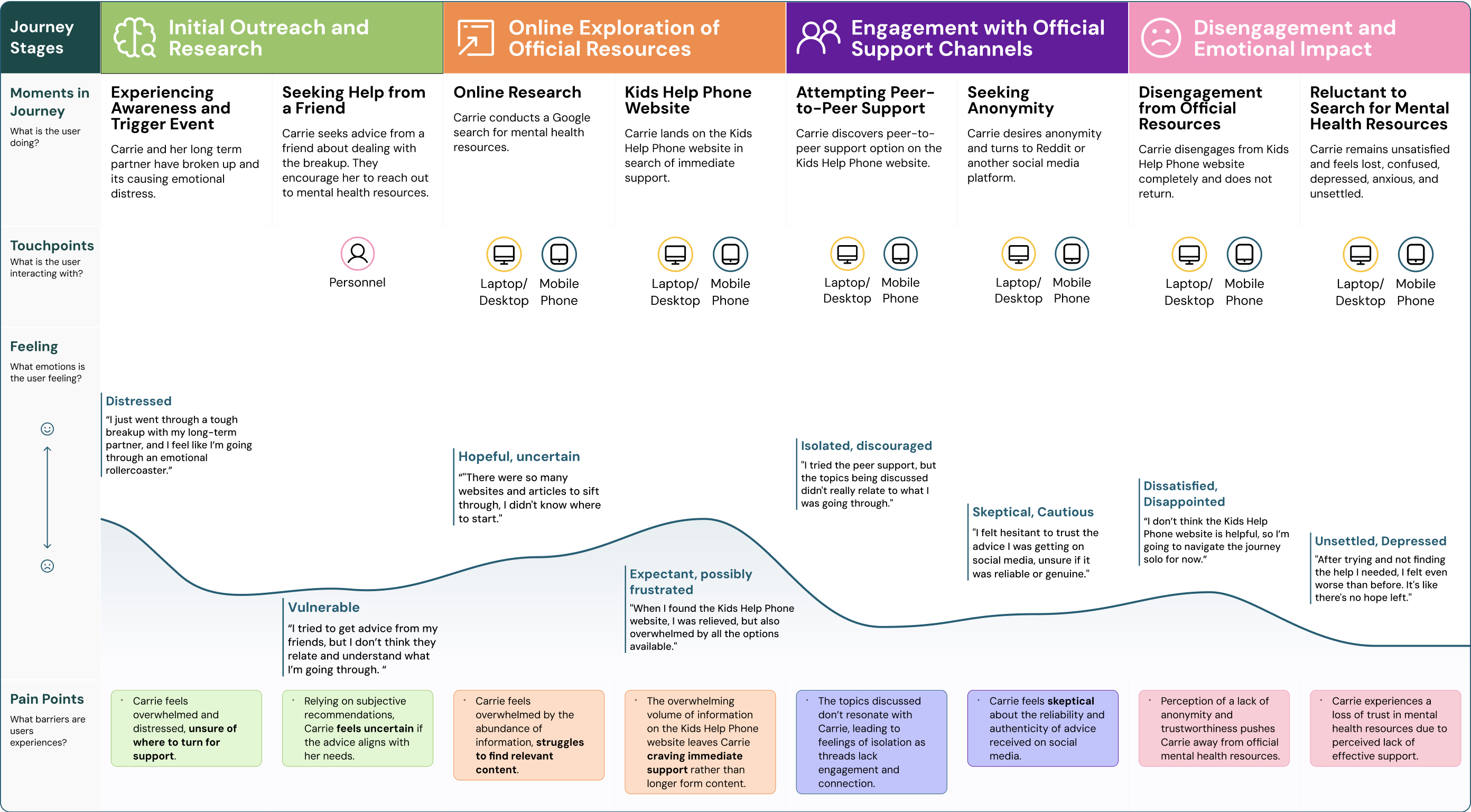
From our research, we created our key persona, Careful Carrie, who represents a cautious young user seeking emotional support and reliable resources. This persona guided our efforts to balance user needs with KHP’s goals.

Each session revealed valuable insights into how youth interacted with KHP’s digital spaces, highlighting navigation challenges and opportunities for improvement. These findings informed our subsequent journey mapping and ideation stages.
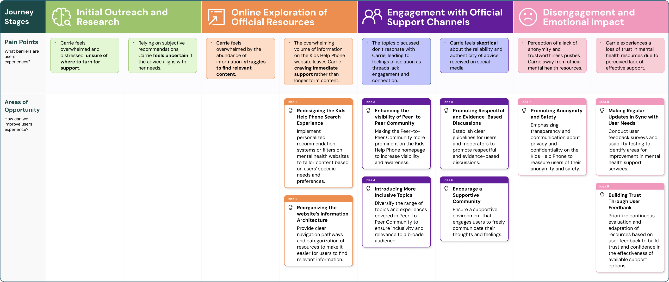
From these findings, we captured Careful Carrie’s journey, outlining her experience with KHP’s resources. This map highlighted each stage of her interaction—from seeking help to navigating the website—along with her emotions, pain points, and opportunities for improvement.
Our team brainstormed solutions to address user pain points and improve engagement. We prioritized ideas based on their impact and feasibility, selecting key features to focus on.
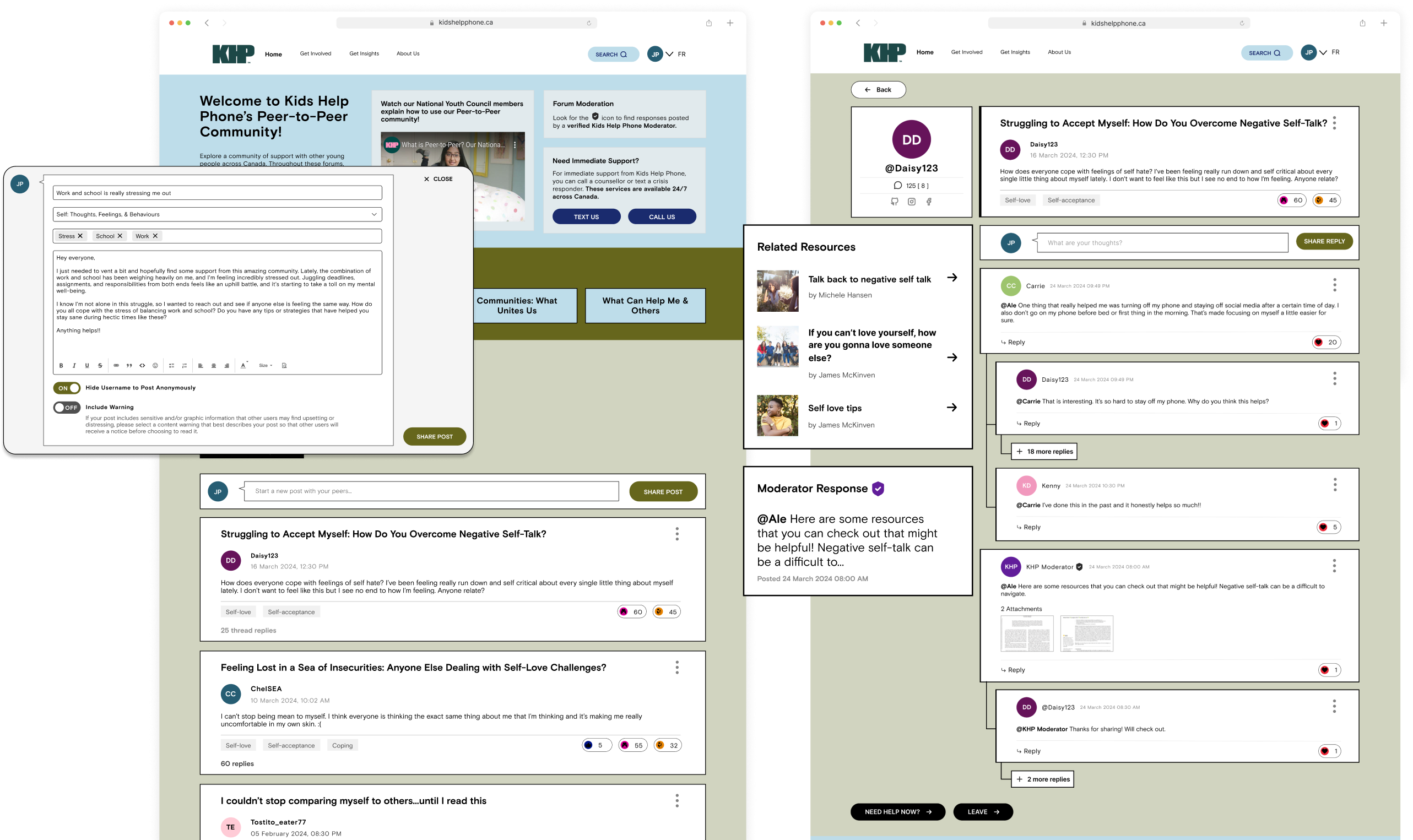
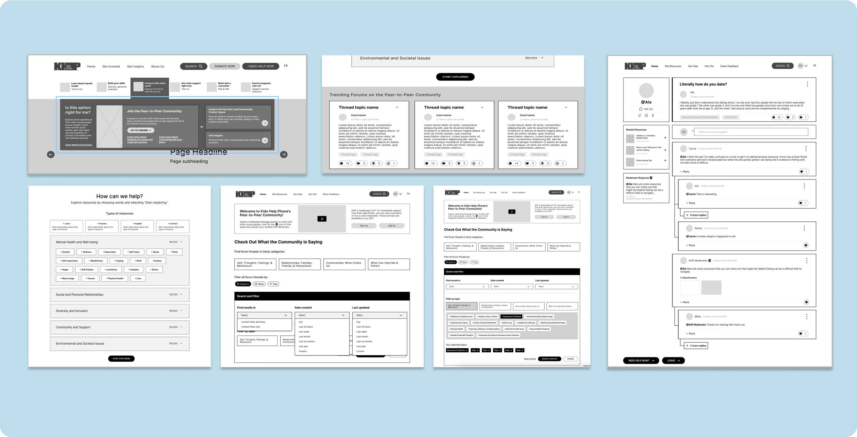
Since I was collaborating with a teammate on the wireframes, consistency was really crucial. I took the initiative to set up our Figma files with local styles, organized the grid system, created sections for each flow, and wrote clear instructions for my teammate to pickup. This helped ensured more smooth handoffs between different wireframe flows and maintained design coherence throughout the project.
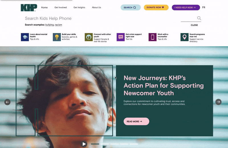
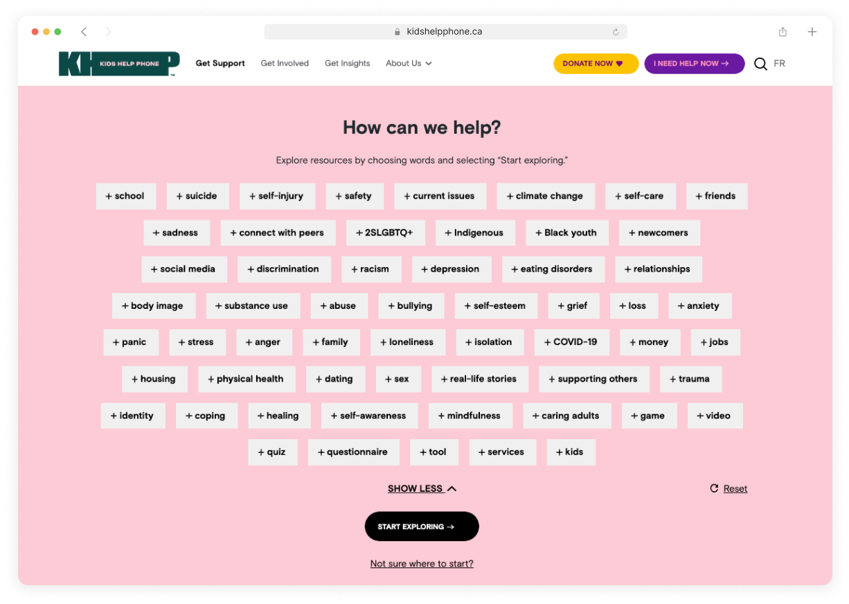
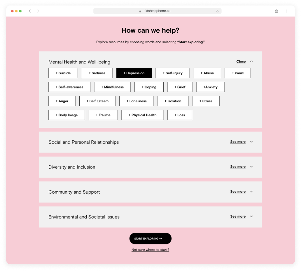
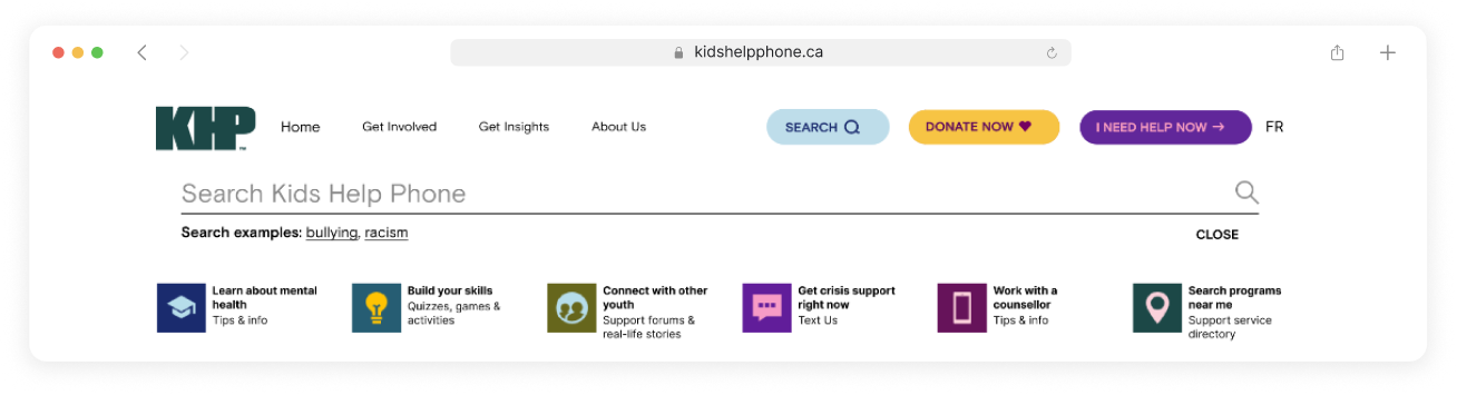
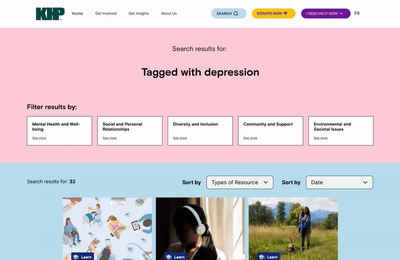
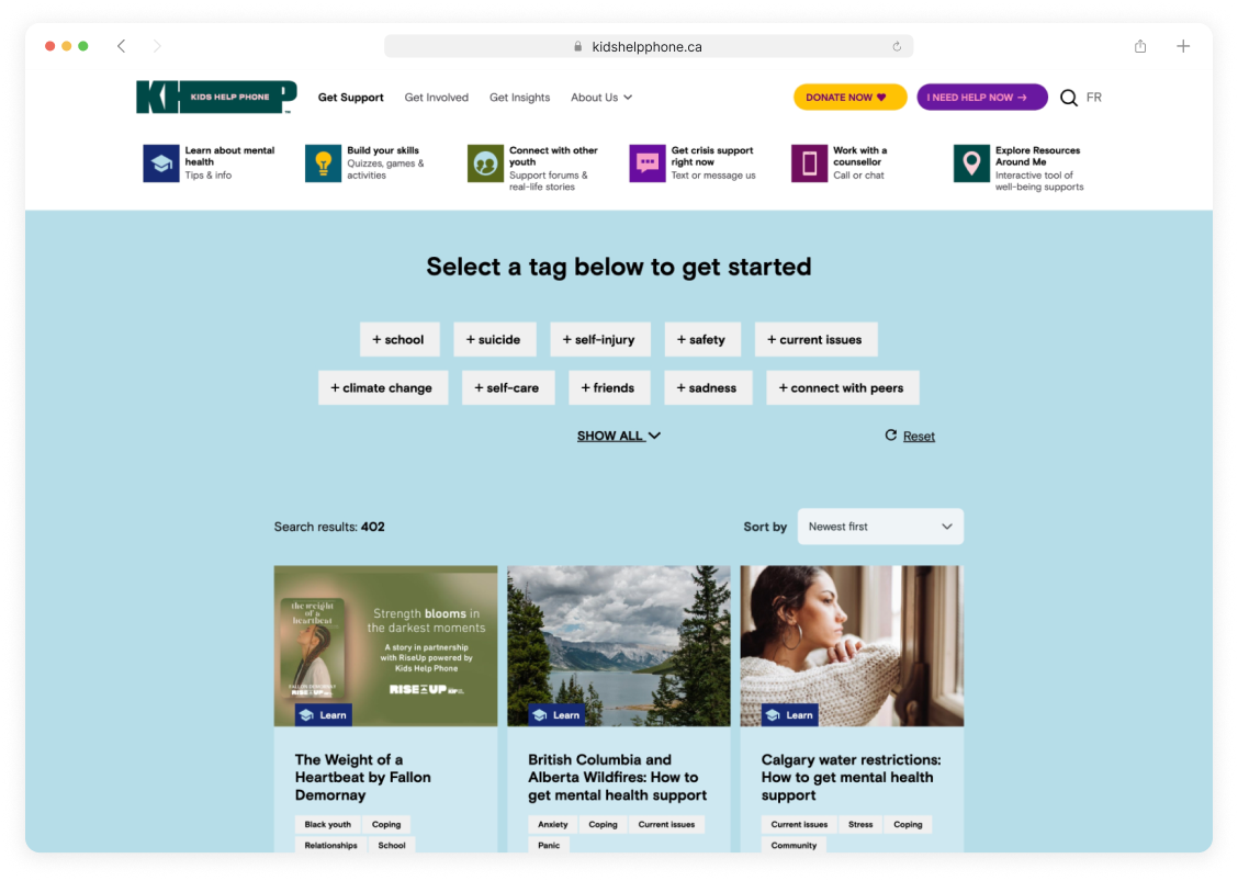
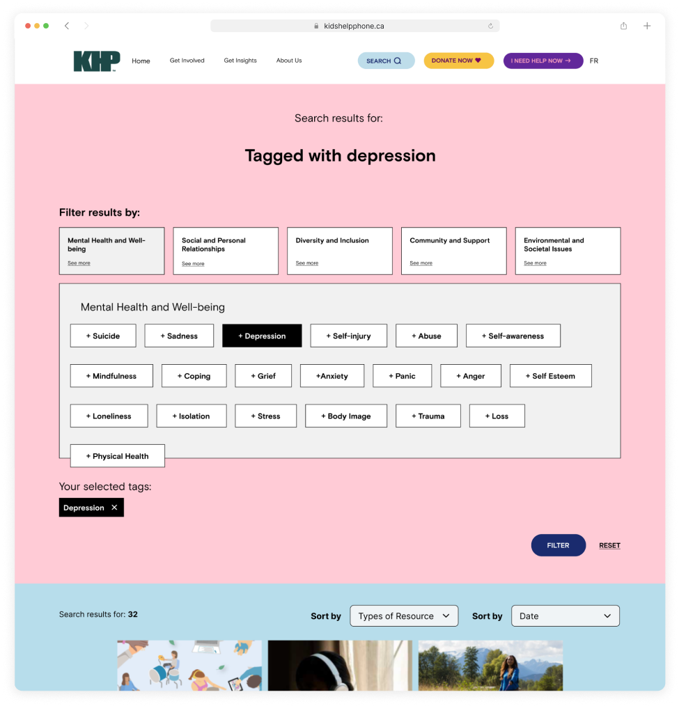
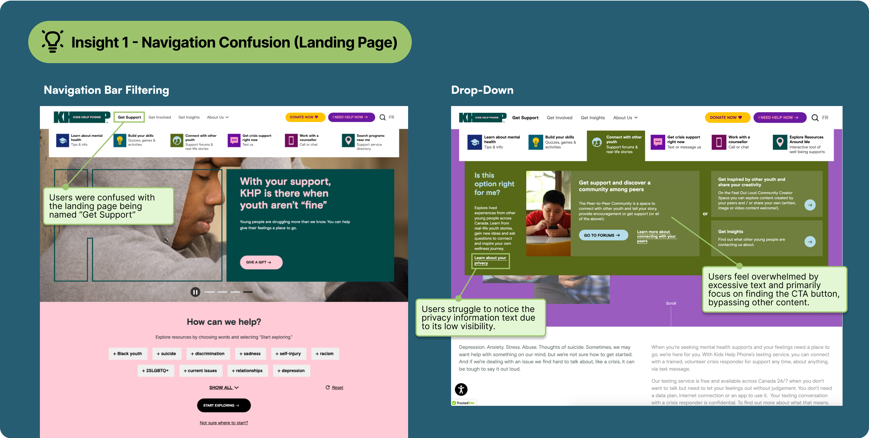
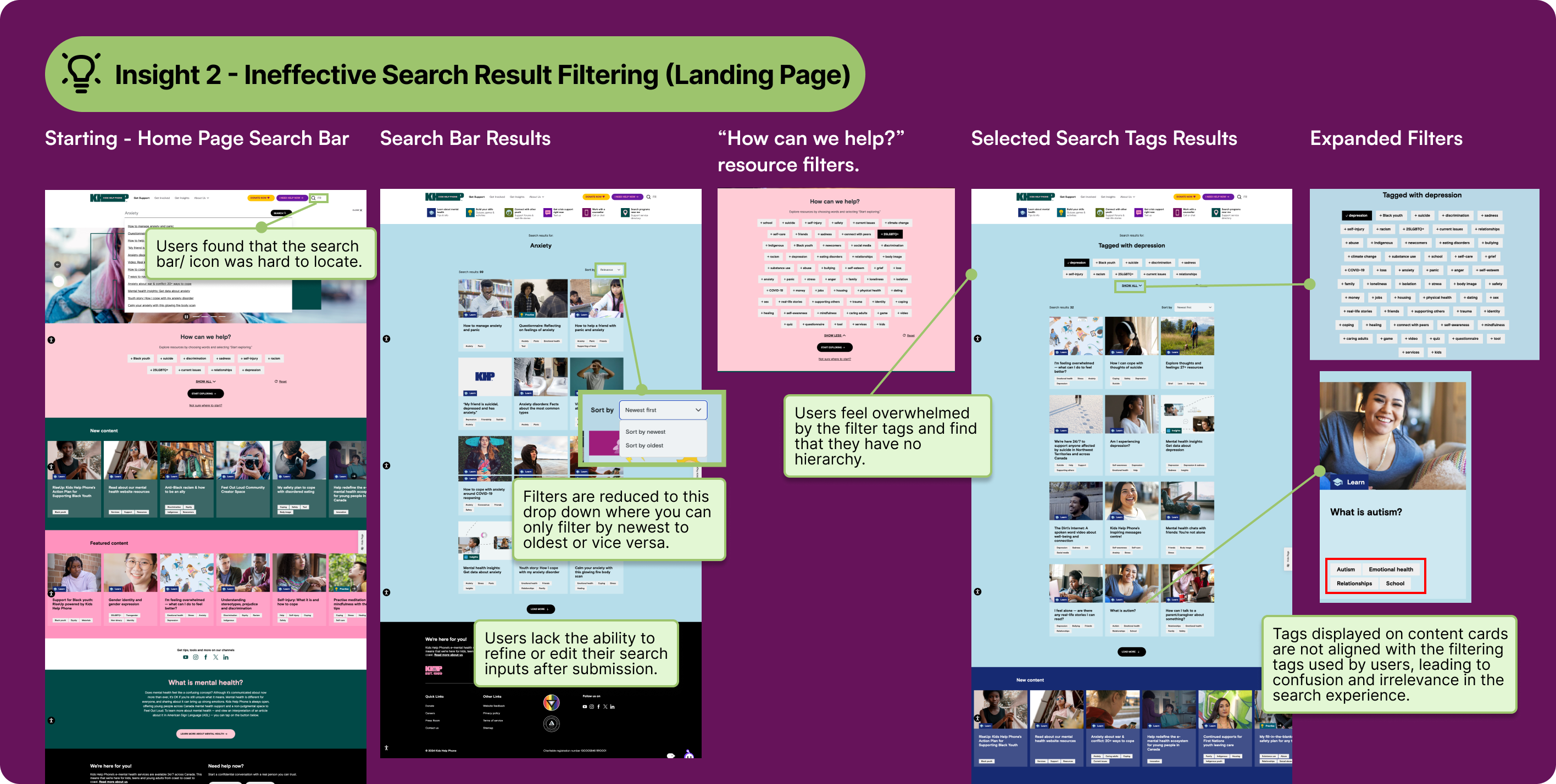
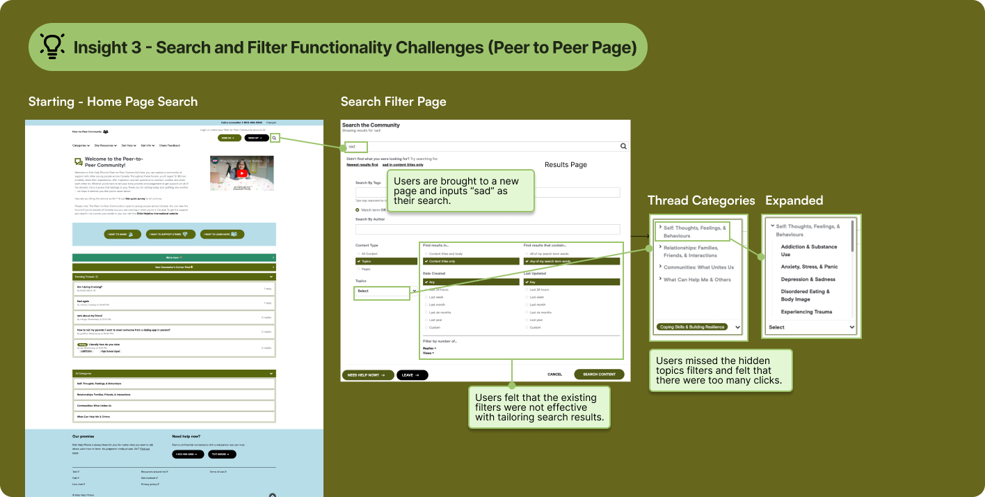
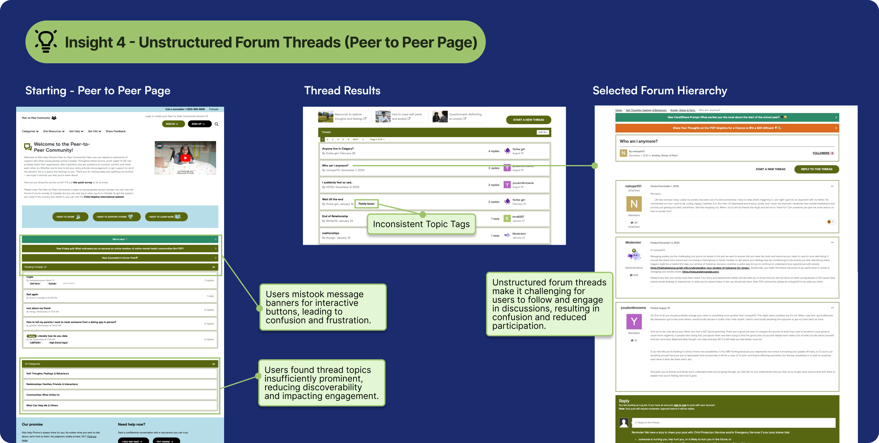
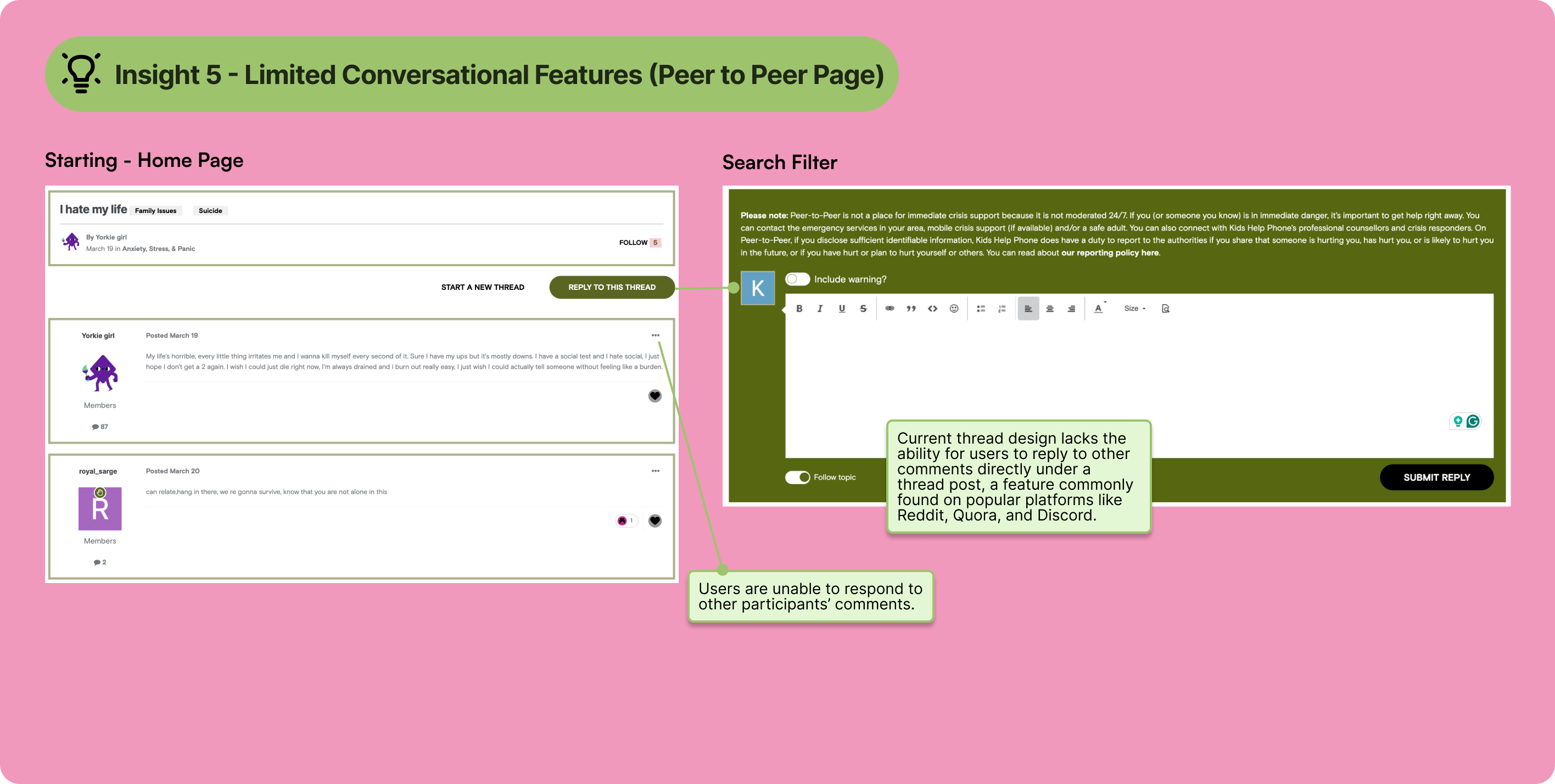
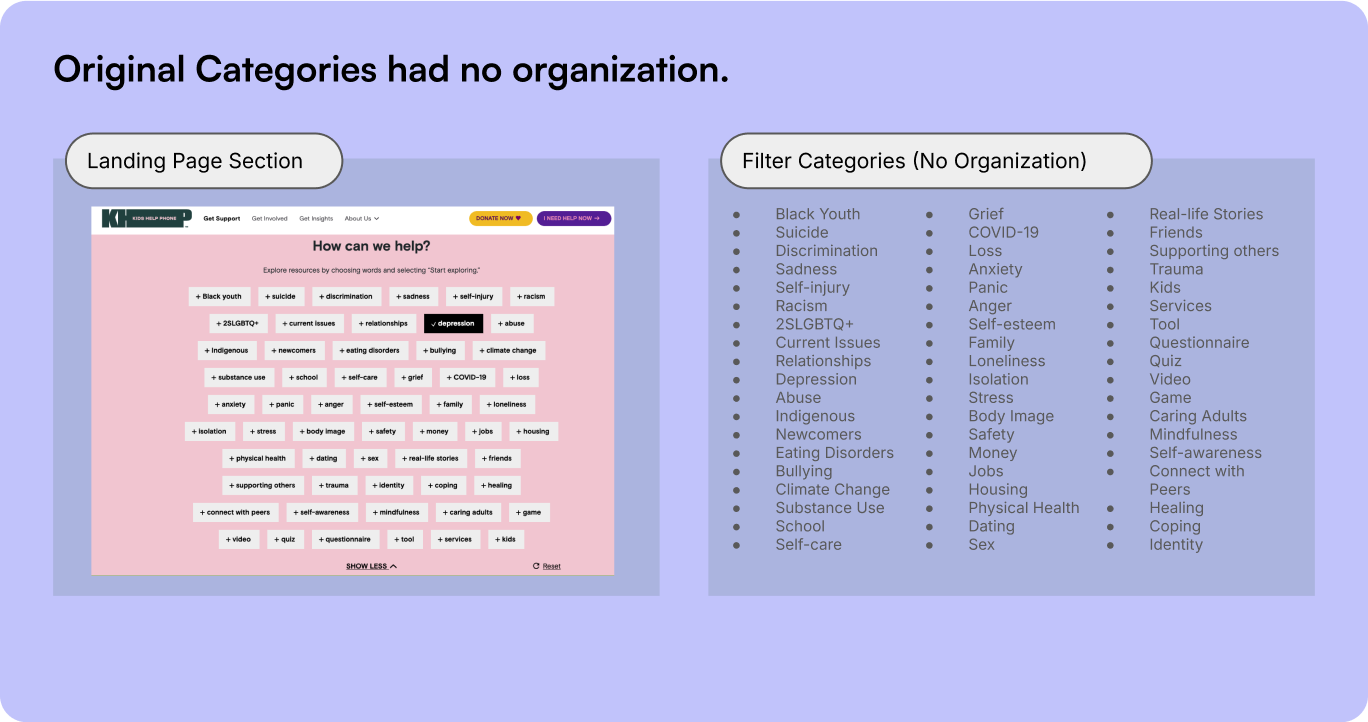
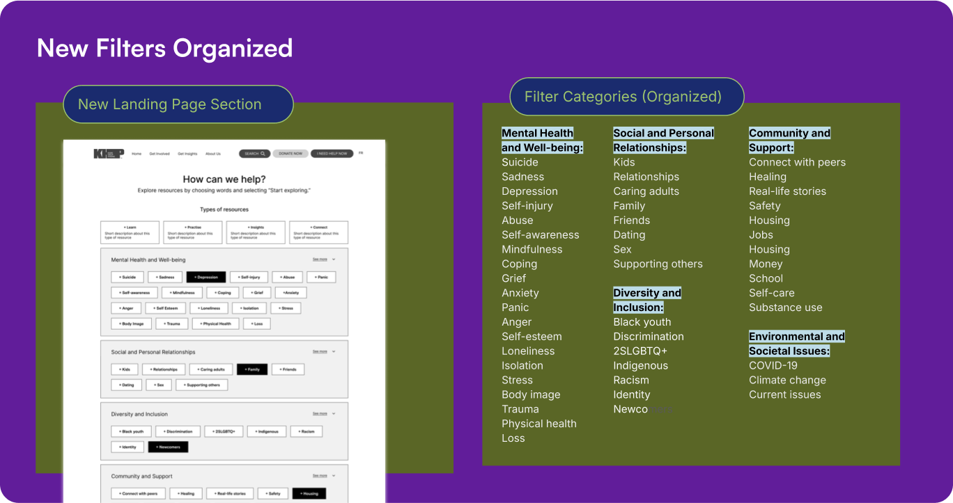
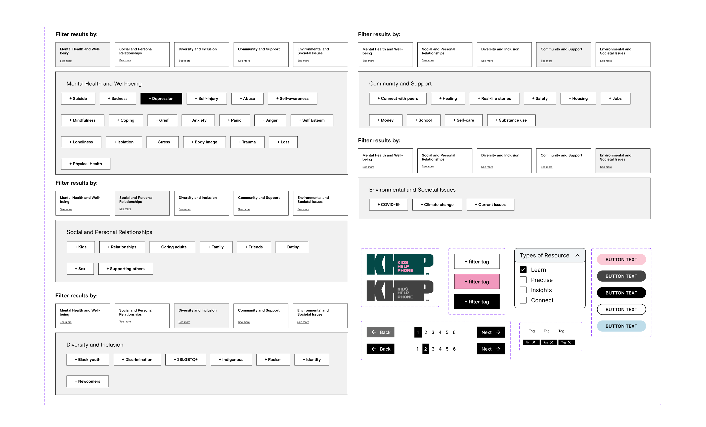
Majority of our users/ participants had mentioned that they felt that the filter options under the “How can we help?” on the landing section, were too overwhelming and unorganized on the current Kids Help Phone landing page.
I led my team in conducting a card sorting activity with 5 participants. Users were given 5 preliminary umbrella themes and then were given time to categorize the tags to the matching theme. From the card sorting findings, we reorganized the filters and categories to simplify how resources were presented. These categories were based on what the majority of our participants proposed, which made it easier for them to find content they needed without feeling overwhelmed.
Before finalizing our designs, we conducted another round of usability testing to validate our approach. I led the testing sessions to ensure that our improvements were making the site easier to use, and we made minor adjustments based on user feedback to fine-tune the experience.
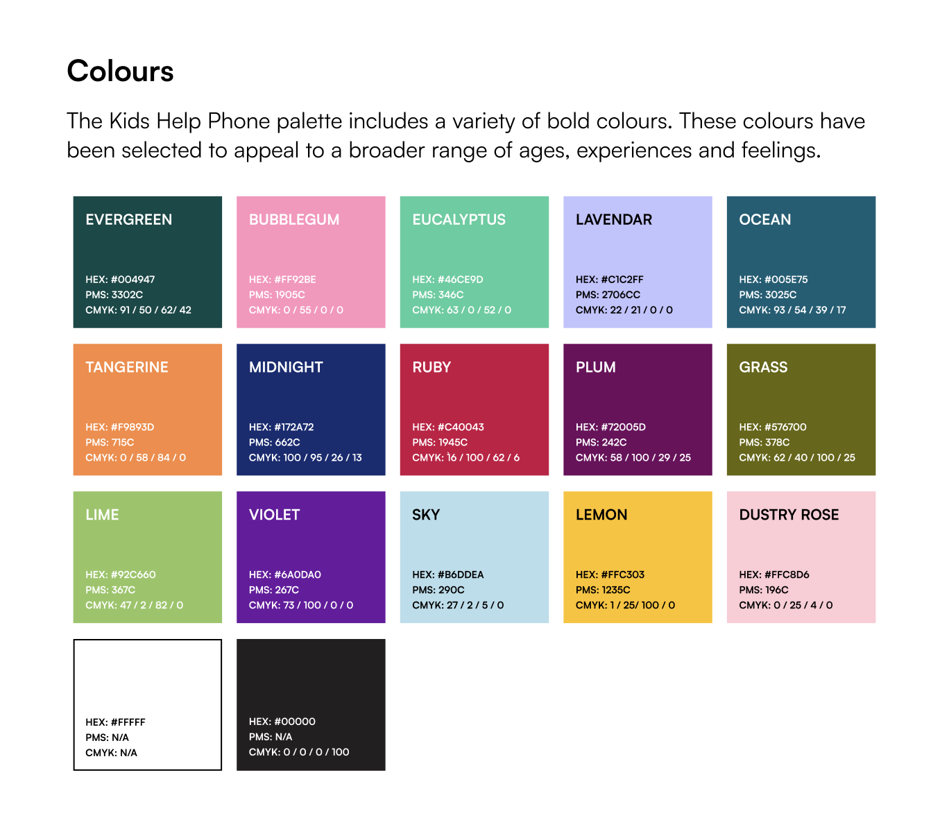
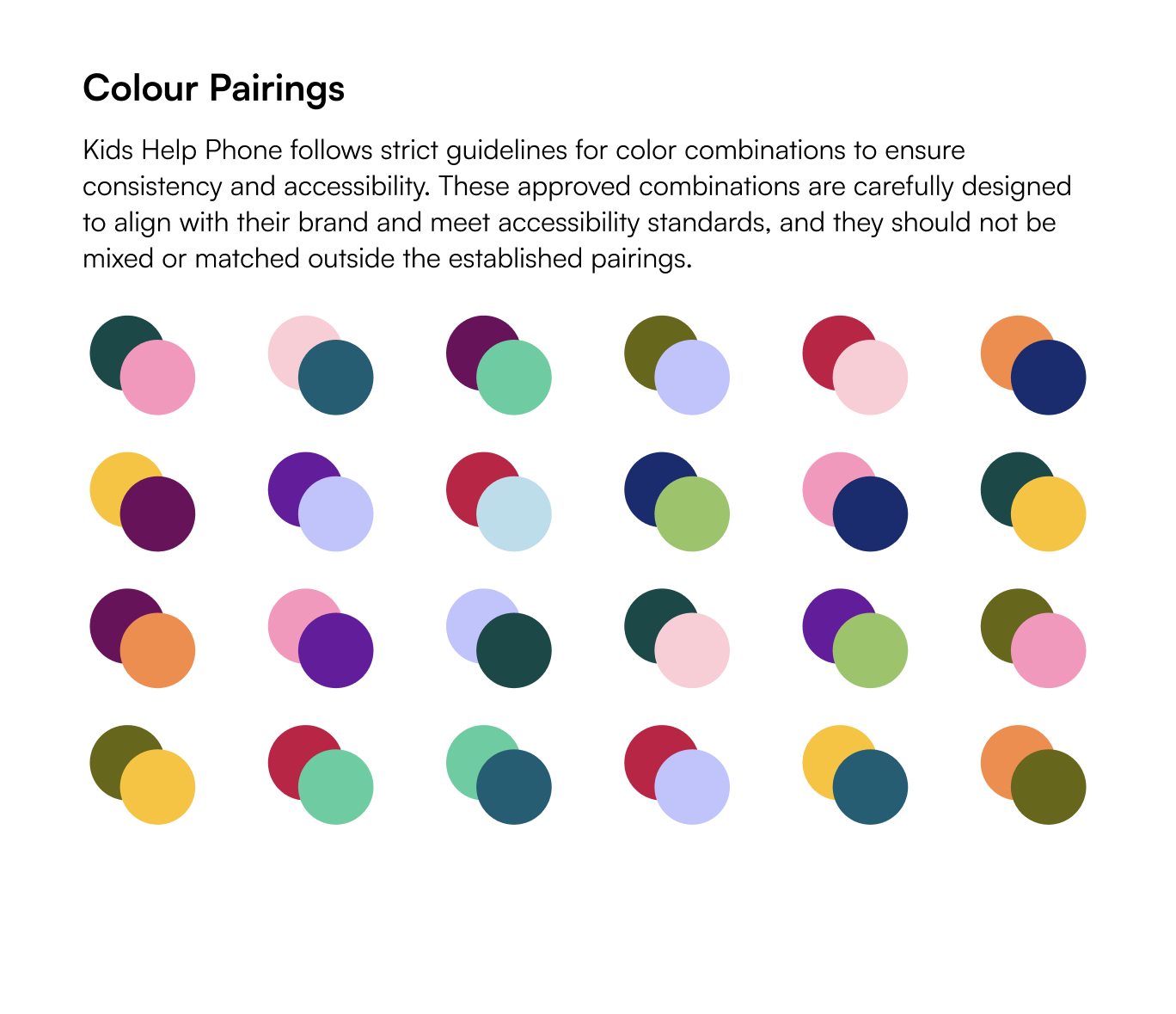
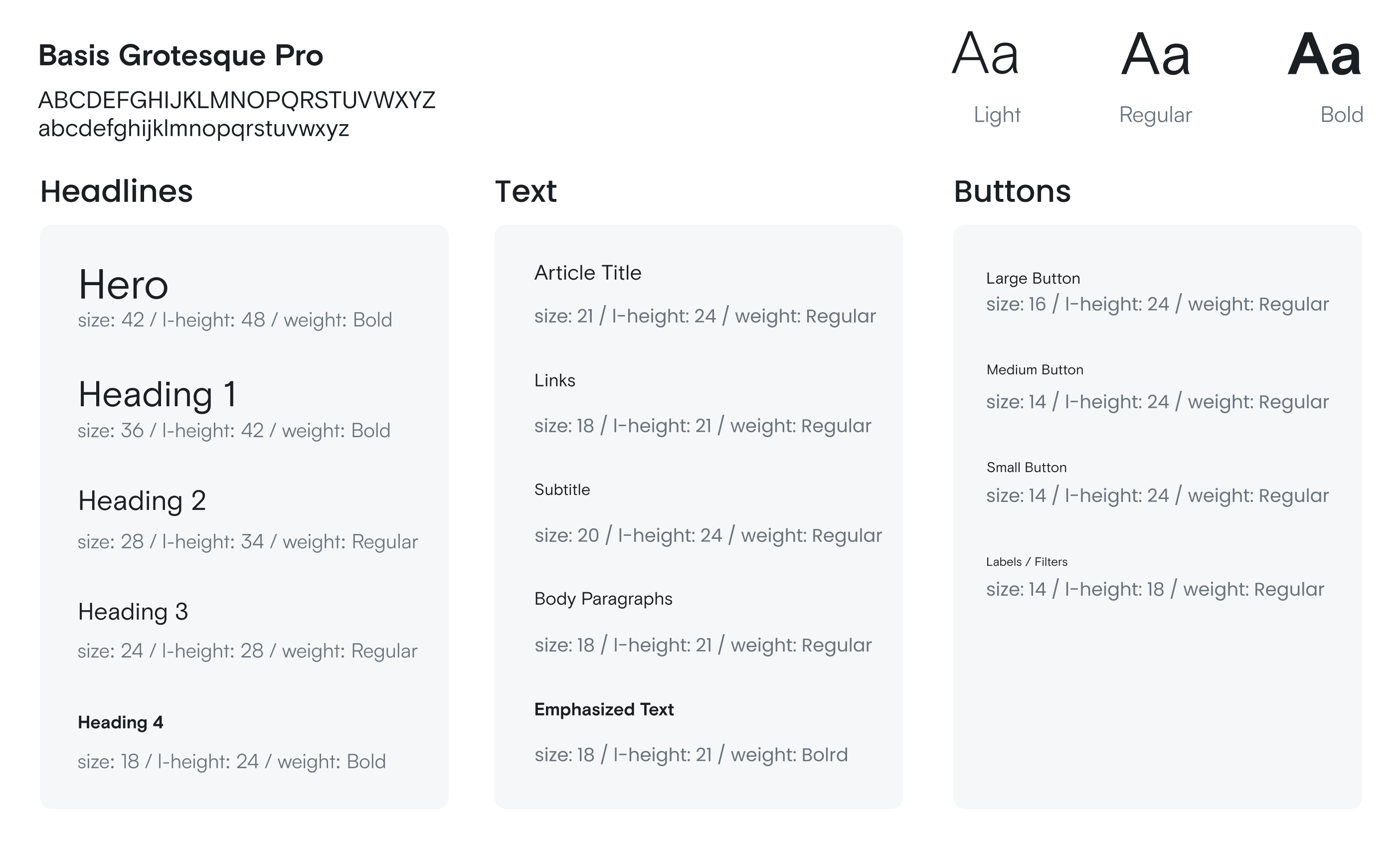
To align with Kids Help Phone’s (KHP) brand, I ensured our designs followed their guidelines for colours, typography, and button styles. KHP’s bold palette and strict colour pairings meet WCAG accessibility standards, which I researched and documented. I created a colour guide for the team to maintain accessibility and brand consistency.
From the feedback that I gathered from the lean evaluation, I made changes to our mid-fidelity prototypes. Below are a few example screens that had the most significant changes. Based on our evaluations, I refined our designs and created the mid-fidelity prototype. I was in charge of unifying everyone’s screen designs to ensure that all screens were cohesive with the same visual style and system.